TJ Construction. Local reputation. National ambition. Brand to match.

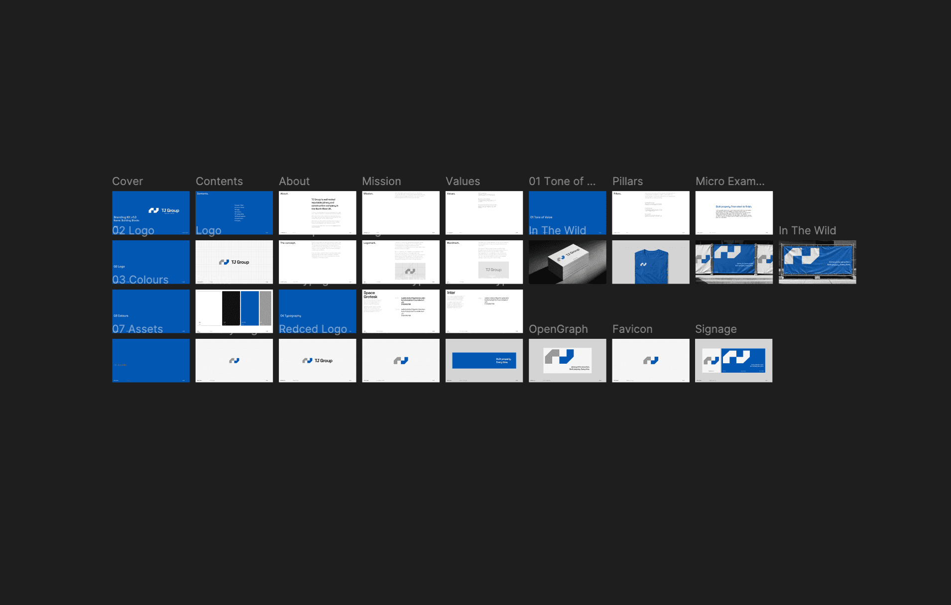
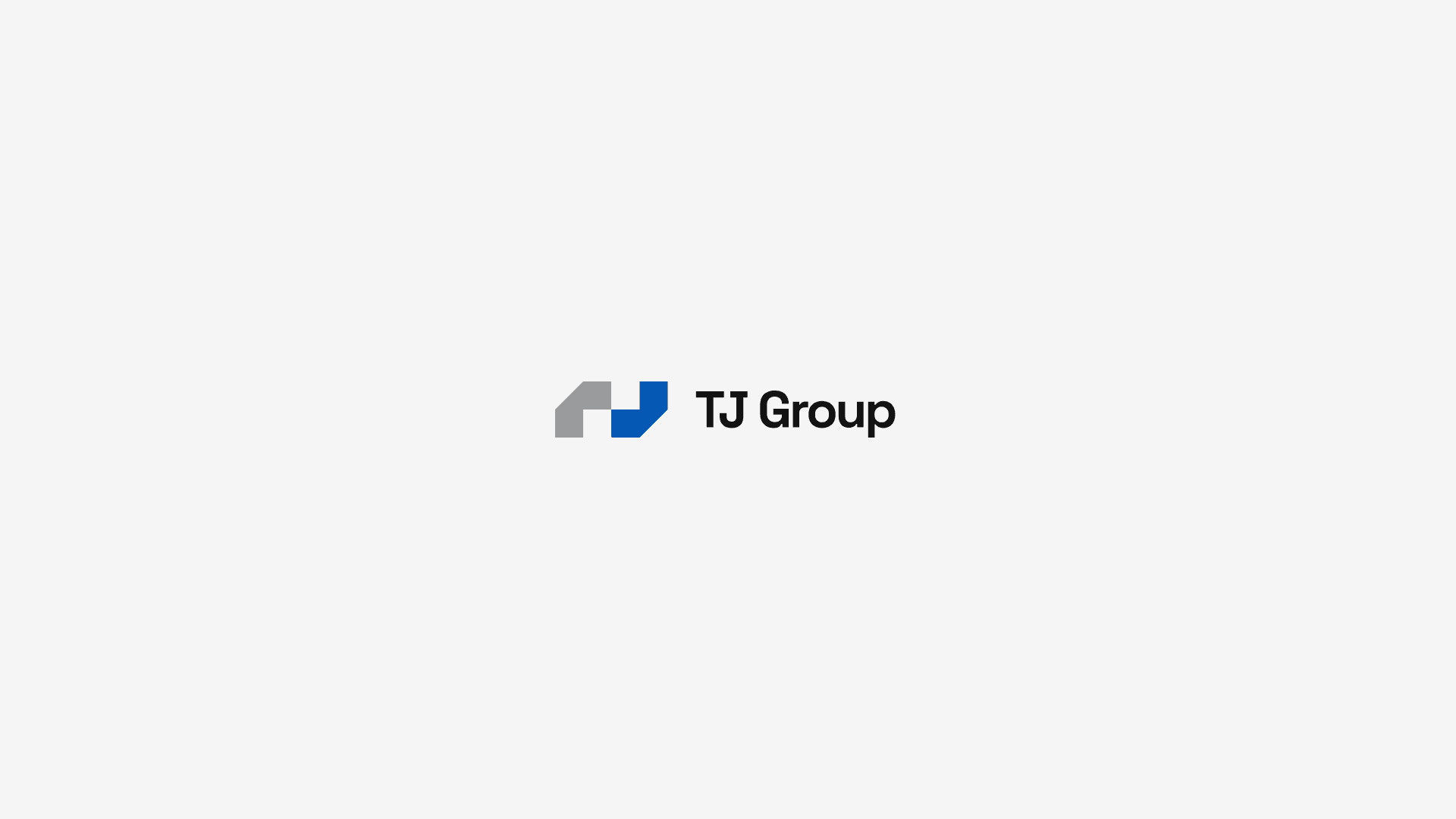
TJ Construction had done the hard part — years of solid work, a strong local reputation in the North West, and a growing list of completed projects. What they hadn't built was a brand and digital presence to match. The goal was to stop competing for small local jobs and start winning larger construction contracts. Extensions, commercial builds, the kind of work that requires a company to look the part before anyone picks up the phone. The existing website was a relic from the early 2000s, untouched since. The owner was already driving traffic through Google Ads — the pipeline existed — but visitors were landing on a page that looked dated and leaving before they reached out. The branding told the same story: a logo shared in spirit with every local trades company in the country. Functional. Forgettable. We rebuilt the identity from the ground up. A new abstract mark rooted in the geometry of construction — stacking, layering, structure. Bold colour, confident typography, blueprint-inspired pattern work. Alongside it, a modern website built on the MM stack: project showcase, gallery, contact-driven funnel. The site is live, enquiries are coming in, and the full brand system is packaged and ready for rollout.
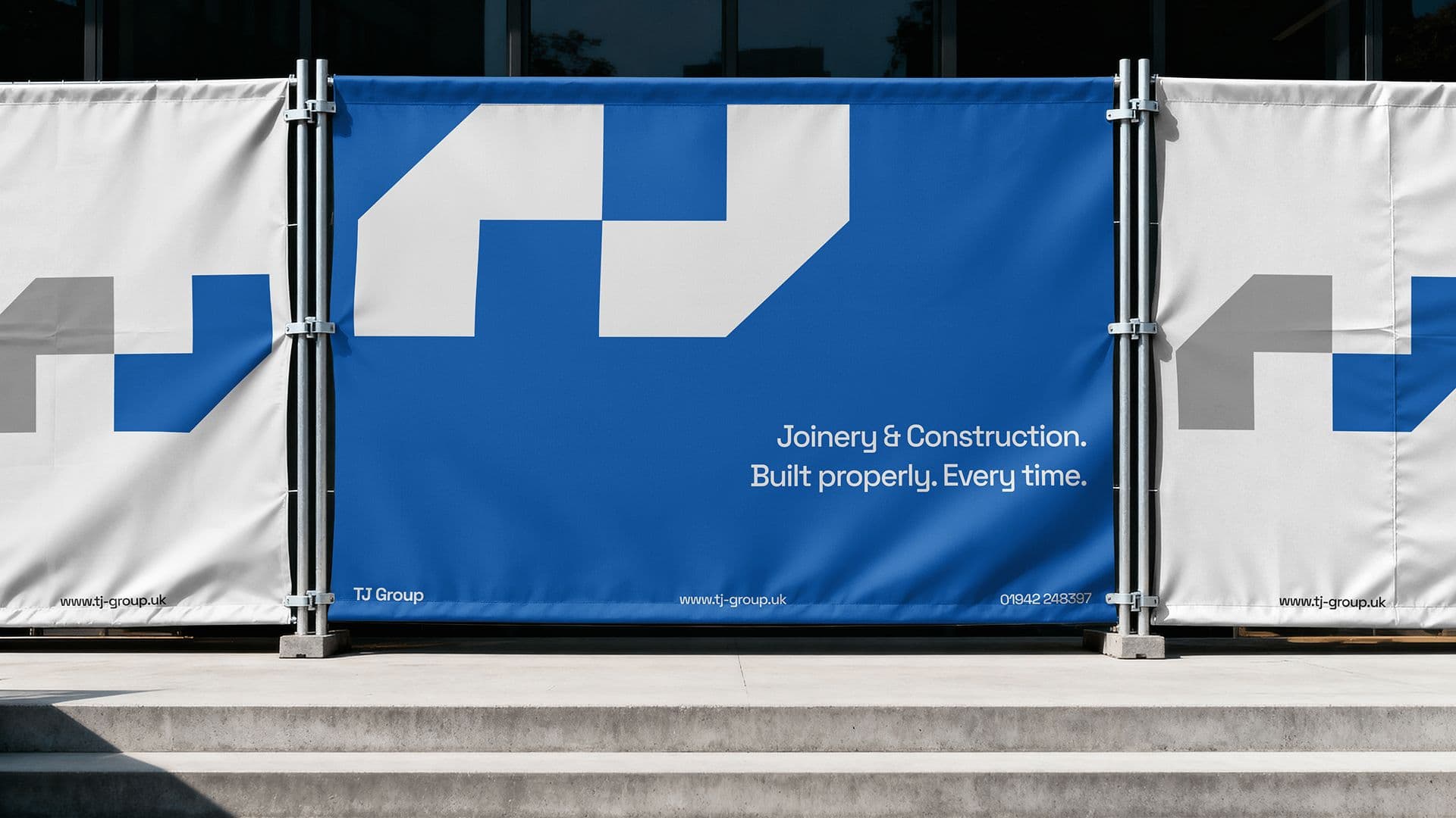
The ads were driving traffic. The website was losing it. We fixed the part that mattered.
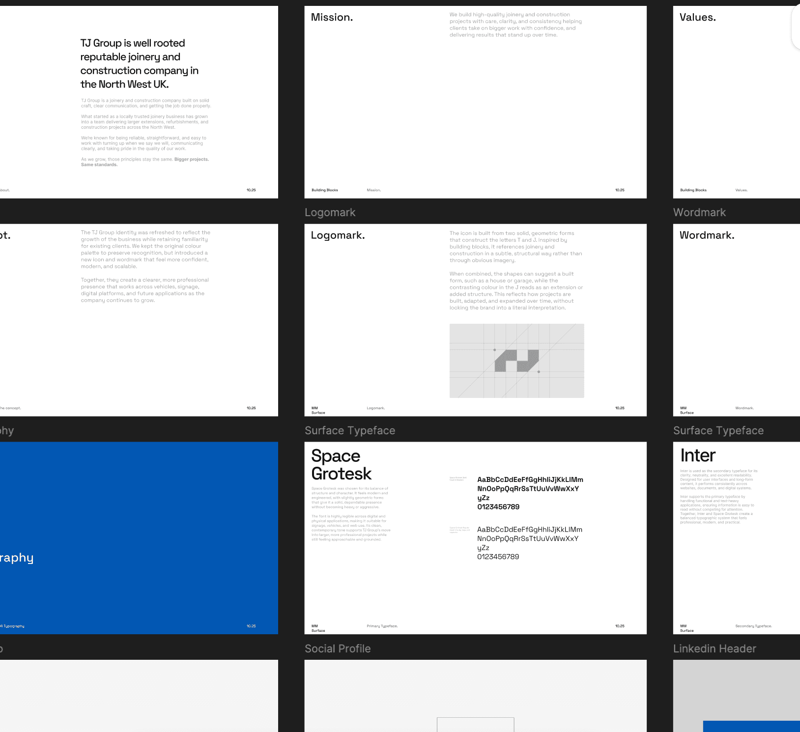
Identity
Full brand system rebuilt — from local trades iconography to a clean, abstract identity built for larger contracts.

Enquiries

First Project
They had the reputation. They just didn't look like it yet.