Minimal Mind Brand Identity. A brand that is exactly what it says it is.

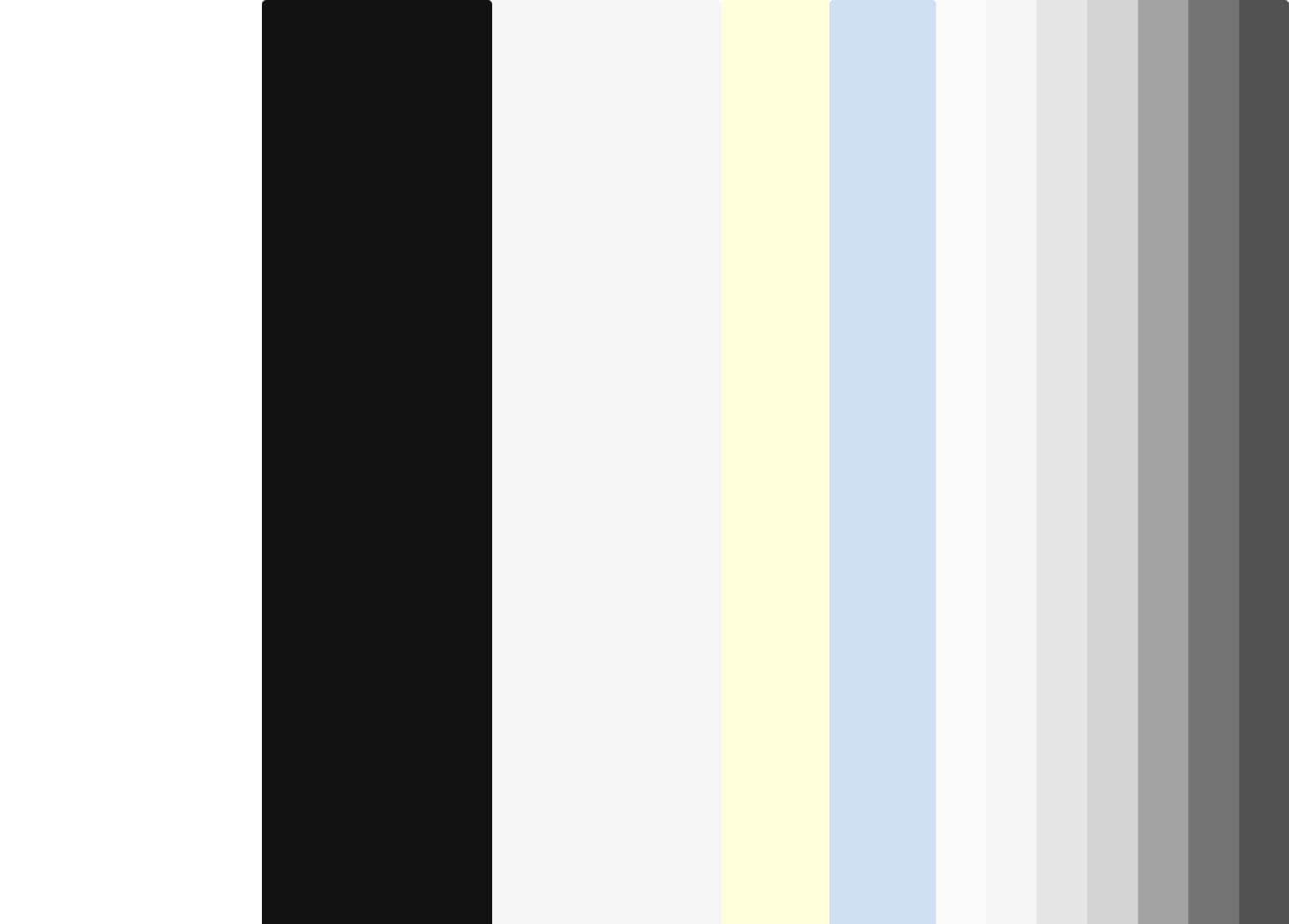
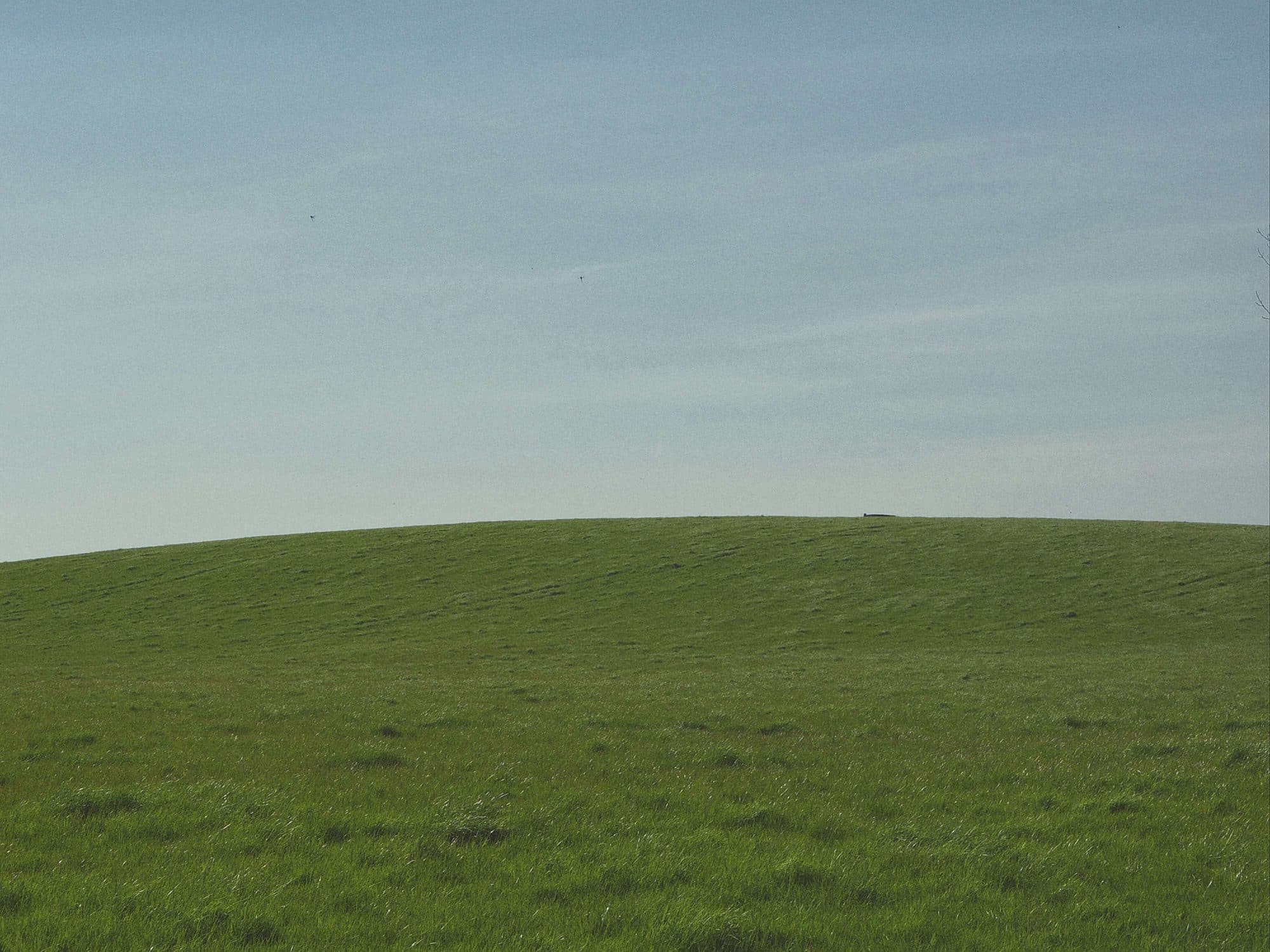
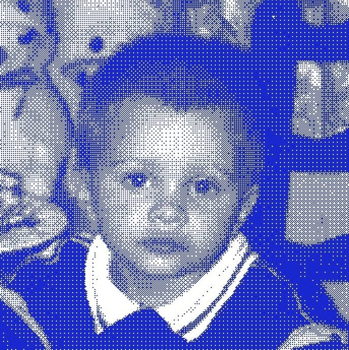
The hardest brief is the one you write for yourself. Minimal Mind needed an identity that lived its own philosophy — not a brand that talked about minimalism while being visually loud, not one that claimed craft while cutting corners on its own design. Fifteen logo iterations later, the answer arrived by going back to first principles: a black square. It stacks like a block, inverts like a black box, renders like a pixel. It required no embellishment. It simply was. The system built around it is split into two worlds. Surface is the gallery layer — warm photography, considered colour, generous whitespace, Geist typography. Shell is the system layer — hard blue, PPNeueBit monospace, the visual language of a terminal. Neither exists in isolation. The design is built to glitch between them. Engineer meets artist. The seam is the point. Four photography presets — Lived In, MM Signature, Disposable, Mono — each with grain, warmth, and deliberate imperfection. Colour named rather than coded: Glow, Rain, off-black, off-white. A tone of voice that is dry-witty, minimal, and quietly expert. And a snake game hidden somewhere on the site, because a studio run by a developer-artist leaves fingerprints. The playfulness is part of the identity. It just doesn't announce itself.
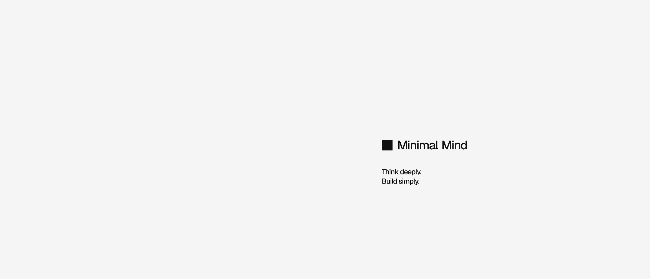
Fifteen iterations to get to a black square. The right answer usually looks obvious in retrospect.
Iterations
15 logo directions explored before landing on the simplest possible answer.
System

Philosophy
Surface is the gallery. Shell is the terminal. The glitch between them is where MM lives.